What’s common between this picture and ecommerce websites?
Well, there was a lot of mist over the city this morning.(look closely)
You could hardly see the buildings.
In fact if you weren’t from Melbourne, you might think there aren’t any tall buildings there at all.
Ecommerce websites aren’t too different.
We often find website visitors totally missing some key pieces of information that would have contributed to their purchase decision, because there’s so much ‘mist’ around them.
If you weren’t in the digital team, you wouldn’t know it’s there! 🔭
This is where conversion data & behaviour analysis really helps identify what customers love and struggle to find.
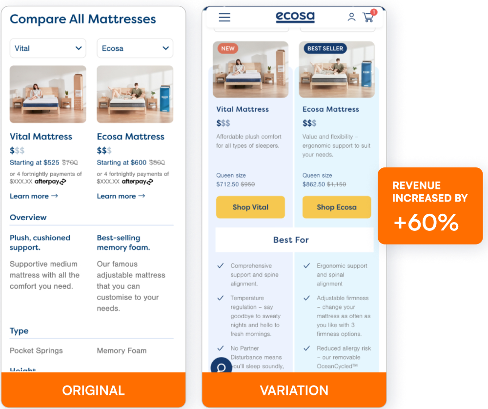
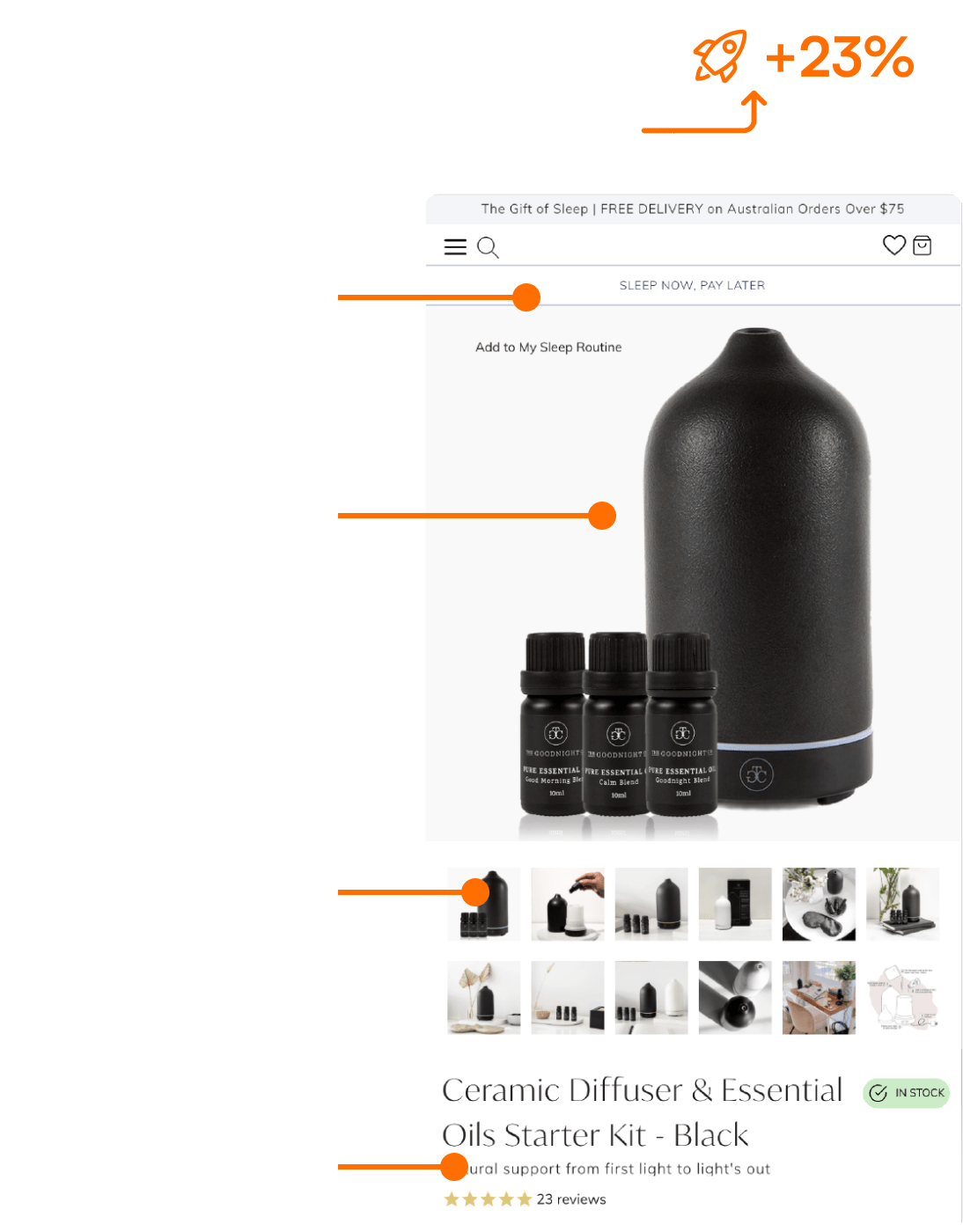
One of our clients were spending so much time and cost updating the Checkout page, but after our conversion analysis, we found the main problems in the funnel were not at Checkout, they were in the Category & Product pages…
…customers were struggling to find critical info.
And after AB testing to those problems, the conversion rate naturally increased.⚡️
Don’t the mist you’re so used to seeing, prevent your customers from finding what they need to find. 🙂
Beat your competition to it!
Get the latest actionable conversion strategies delivered straight to your inbox!


